
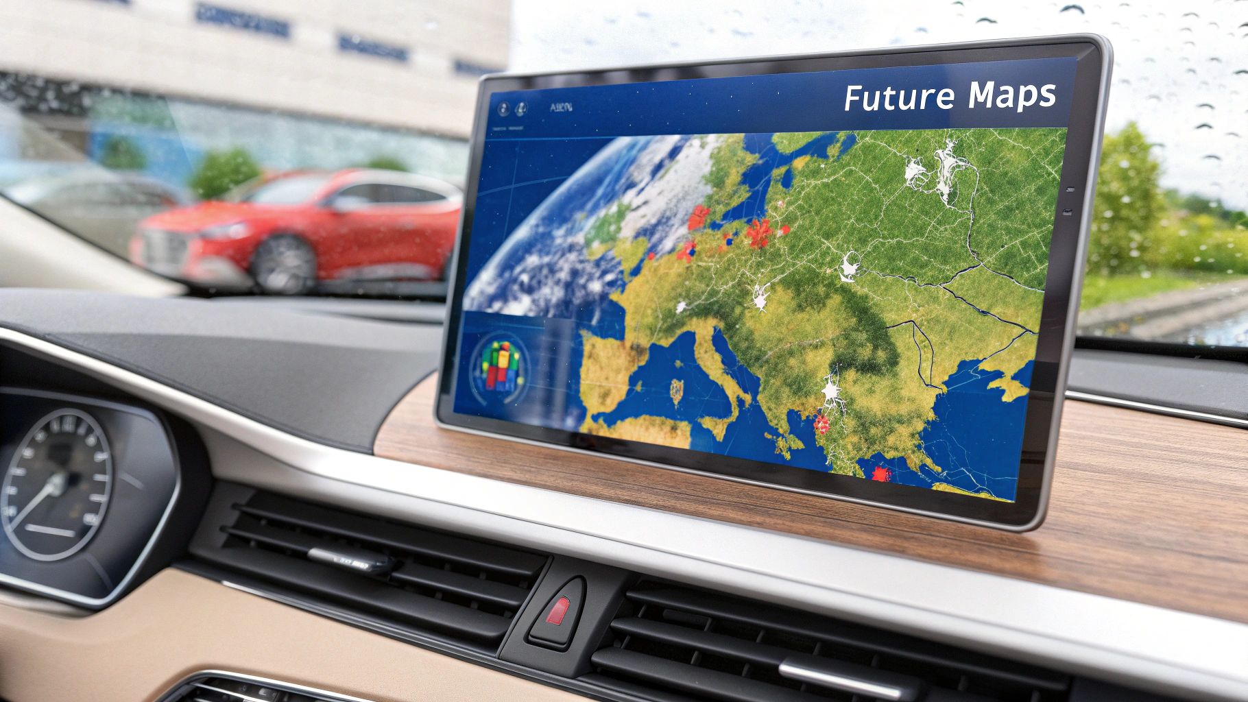
A weather map is a visual representation of atmospheric conditions over a specific geographic area. It translates complex meteorological data—including temperature, air pressure, wind, and precipitation—into a strategic tool. For Texas-based business leaders in sectors like Energy, Logistics, Agriculture, and Construction, a weather map is not just a forecast; it is a critical instrument for operational risk management.
Weather Maps Aren’t Just for Meteorologists
For any Texas business, a weather map is an operational dashboard for mitigating risk. It provides the visual intelligence needed to anticipate disruptions, protect assets, and ensure personnel safety. It serves as a blueprint for managing weather-related threats, enabling proactive rather than reactive decision-making.
These maps are indispensable for making informed, data-driven decisions that protect the bottom line. For example, a construction manager in Dallas can analyze a surface map to see an approaching cold front and reschedule a critical concrete pour, preventing thousands of dollars in material loss. A logistics coordinator in Houston can use real-time radar to reroute trucks around a developing thunderstorm, maintaining driver safety and delivery schedules. The financial impact of such events can be substantial; the 2021 Texas freeze, for instance, caused an estimated $195 billion in damages, highlighting the necessity of proactive weather risk assessment.
Turning Data Points Into Strategic Insight
To extract actionable intelligence from a weather map, one must understand its core components. While today’s digital maps are a significant advancement from their 19th-century paper predecessors, the fundamental elements remain consistent. The concept of automating map creation for practical use began in the U.S. around 1969, leading to the sophisticated tools available today.
A well-interpreted weather map helps a business answer critical questions that directly impact operational continuity:
- Pressure Systems: Does a developing low-pressure system signal an impending storm that could threaten our Gulf Coast facility?
- Frontal Boundaries: Will a sharp cold front bring a sudden freeze that could damage equipment or agricultural assets in the Panhandle?
- Wind Patterns: Will shifting winds associated with a tight pressure gradient require us to halt crane operations or adjust emissions management at our plant?
By translating raw meteorological data into a clear visual story, weather maps empower leaders to shift from a reactive to a proactive stance on weather risk. In a state with a climate as dynamic as Texas, this shift is fundamental to building operational resilience.
Understanding these visual tools is a crucial first step in building a robust risk mitigation strategy. Learning to read them effectively provides a deeper understanding of the most accurate weather forecasts, allowing that knowledge to be directly applied to business continuity plans.
Key Weather Map Elements And Business Impacts
To bridge the gap between meteorological symbols and real-world business decisions, this reference guide breaks down common map elements and their potential impact on Texas operations.
| Map Element | What It Represents | Potential Impact On Operations |
|---|---|---|
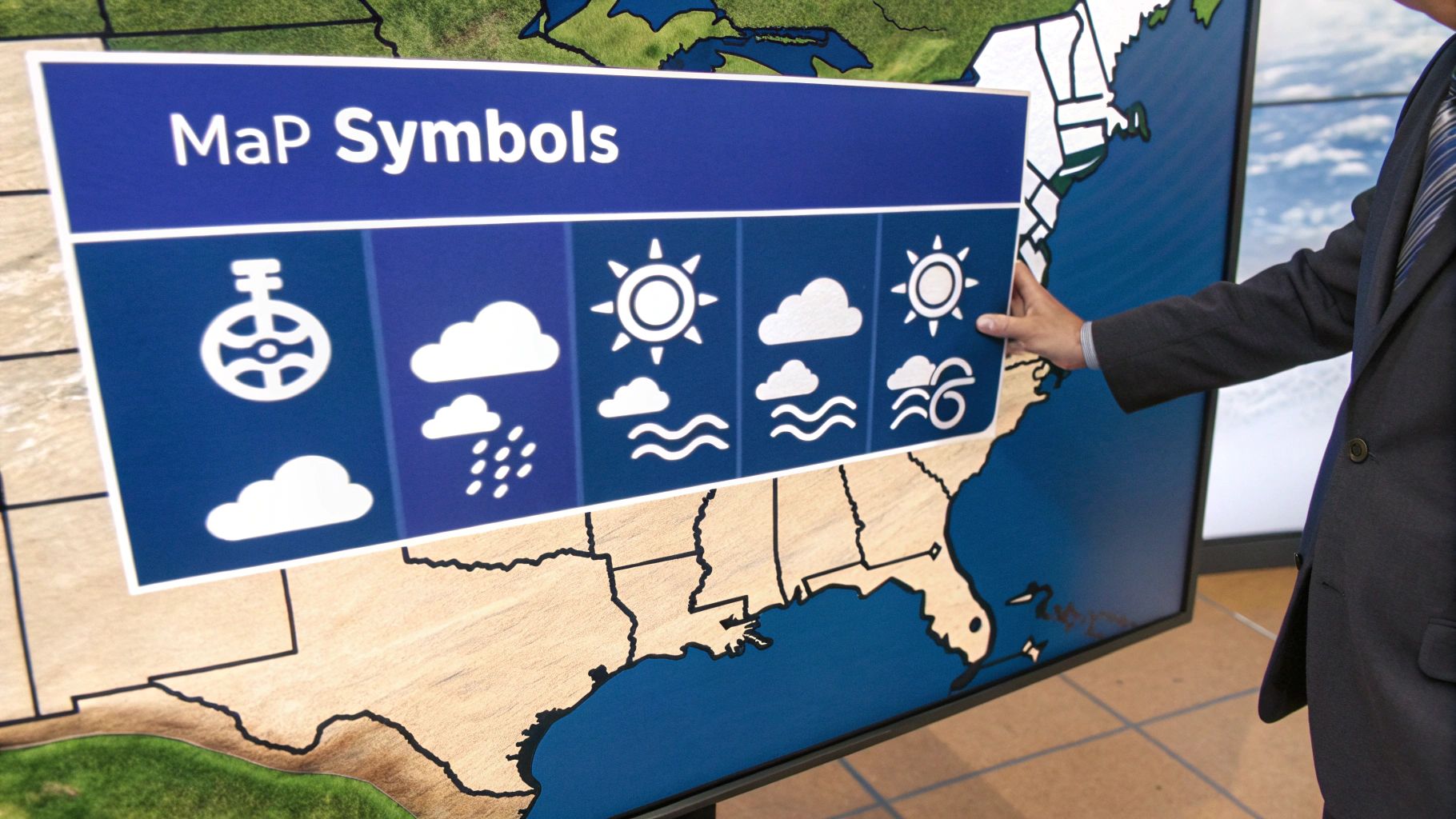
| Blue Line with Triangles | A cold front, marking the leading edge of colder, denser air. | Can bring sudden temperature drops, high winds, and intense but brief storms. Risk of flash freezes for agriculture and equipment. |
| Red Line with Semicircles | A warm front, where warmer, lighter air is advancing. | Often brings steady, prolonged precipitation and overcast skies. Can impact outdoor work schedules and transportation over several hours or days. |
| "L" Symbol | A low-pressure system, where air is rising. | Associated with cloudy, rainy, and stormy weather. A strong low-pressure system can signal significant storm development. |
| "H" Symbol | A high-pressure system, where air is sinking. | Generally indicates clear skies and calm, stable weather. Can also lead to prolonged heatwaves or stagnant air quality conditions. |
| Closely Spaced Isobars | Lines connecting points of equal air pressure. | Signifies a steep pressure gradient, which means high winds. This is critical for construction (crane operations), shipping, and aviation. |
This is not an exhaustive list but covers the fundamentals. Recognizing these key features allows executives to quickly assess developing weather situations and make faster, more informed operational decisions.
Disclaimer: ClimateRiskNow does not sell insurance or financial products. The information provided in this article is for educational purposes only and should not be interpreted as financial advice or an insurance recommendation.
Tracing The Evolution Of Weather Maps
Today's weather maps are the result of a long history of breakthroughs, with each step dramatically improving how quickly and accurately we can forecast weather for business operations. In the 19th century, the first weather charts were drawn by hand using data transmitted via telegraph. This slow process provided only a delayed snapshot of weather patterns, making proactive business planning nearly impossible.
A major turning point was the development of analytical techniques like frontal analysis, which enabled meteorologists to identify and track the boundaries between different air masses. This innovation transformed static maps into genuinely predictive tools, giving industries their first reliable advance notice of approaching weather systems.
From Paper Charts To Digital Dashboards
Another crucial development was the station model, a compact symbol that condenses multiple weather data points—temperature, pressure, wind—for a single location on the map. This allowed for much richer, more detailed charts. In the U.S., the Daily Weather Map has been published for over 140 years, evolving from sparse data points into complex charts dense with information. This level of detail could inform everything from agricultural planting schedules to safety protocols at a construction site. You can explore more on the history of these map innovations.
Today’s digital platforms are the direct descendants of these historical efforts. They integrate satellite and radar data with powerful analytics, providing the dynamic, real-time intelligence needed for modern risk management.
Each step in this evolution—from the telegraph to station models and satellites—has made weather data more actionable. For industries in Texas, this progression is vital. Accurate, timely information can be the differentiating factor between operational continuity and a costly, disruptive shutdown. These historical developments laid the groundwork for the sophisticated analysis now possible with a modern weather computer model.
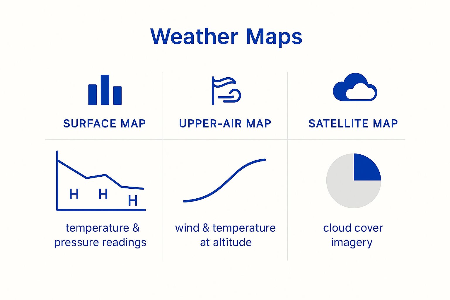
Comparing The Main Types Of Weather Maps
Understanding the definition of a weather map is the first step; recognizing that different maps serve different purposes is the next. For business leaders in Texas, selecting the right map is key to transforming raw data into an operational advantage. Each type offers a unique lens for viewing atmospheric conditions.
The three primary types—surface analysis, satellite, and radar—provide distinct but complementary views. A surface analysis map offers a foundational blueprint, showing the large-scale picture of pressure systems and fronts. Satellite and radar deliver more focused, immediate intelligence on specific threats like cloud cover and active precipitation.
Surface Analysis Maps The Strategic Overview
A surface analysis map provides a strategic command-center view. It synthesizes data from ground-based weather stations, using lines called isobars to connect points of equal pressure and clearly marking the boundaries between cold and warm fronts.
A logistics coordinator in Houston relies on this map for long-haul planning. Spotting a strong cold front building in the Panhandle provides a crucial 24- to 48-hour lead time to reroute shipments, avoiding high winds and potential black ice. It is an indispensable tool for proactive, multi-day operational planning.
Satellite Imagery The Weather Selfie
Satellite maps offer a top-down view from space, showing cloud cover and enabling the tracking of large-scale systems like a hurricane in the Gulf of Mexico or a storm cluster over West Texas.
An energy plant manager on the Gulf Coast uses satellite imagery to monitor a tropical disturbance as it organizes. This visual confirmation is the trigger to initiate hurricane preparedness protocols, long before the storm appears on radar. Learning to leverage public resources for this is a critical skill, as demonstrated in our expert NOAA data analysis for Texas facilities.
Radar Maps The Tactical Ground Truth
While satellite maps show where storms could be, radar maps show where they are right now. Radar technology bounces radio waves off precipitation—rain, hail, or snow—to provide a real-time, high-resolution picture of conditions in your immediate area.
A construction foreman in Dallas uses radar to monitor local weather. When a line of severe thunderstorms appears and moves toward the job site, they can make an immediate decision to halt a concrete pour or secure a crane. This rapid action prevents material loss and ensures crew safety with pinpoint timing.
Each of these views provides a unique layer of intelligence. You get the broad pressure patterns from surface maps, the specific cloud formations from satellite, and the on-the-ground reality from radar.
Comparing Weather Map Types For Business Use
To make the best operational decisions, it is helpful to see how these maps compare. The right tool depends on whether you are planning for the next 48 hours or the next 48 minutes. This table breaks down the core function of each map type for Texas industries.
| Map Type | Primary Data Shown | Best Use Case For Texas Industries |
|---|---|---|
| Surface Analysis | High/Low-pressure systems, cold/warm fronts, isobars. | Strategic Planning: Logistics and supply chain managers use it for multi-day route planning to avoid large-scale weather systems. |
| Satellite Imagery | Cloud cover, storm system organization, hurricane tracking. | Advanced Warning: Coastal energy and chemical facilities use it to monitor tropical systems and initiate preparedness plans. |
| Radar | Real-time precipitation (rain, hail, snow) location and intensity. | Immediate Safety: Construction, agriculture, and outdoor event managers use it for minute-by-minute decisions to protect assets and personnel. |
A comprehensive risk management approach utilizes all three. A surface map sets the strategic stage, satellite imagery tracks developing threats, and radar provides the tactical intelligence for immediate action at your specific location.
Interpreting Weather Maps To Spot Risks
Understanding what a weather map shows is one thing; using it to actively identify operational threats is another. For industries across Texas, this skill transforms a weather map from a passive graphic into a powerful risk management tool. The key is to spot subtle clues in pressure lines, fronts, and precipitation that signal an impending disruption.
Isobars—the lines connecting areas of equal atmospheric pressure—are analogous to contour lines on a topographic map. When spaced far apart, they indicate calm weather. When packed tightly, they represent a steep "pressure cliff," which translates directly to high winds. A petrochemical plant manager in Corpus Christi seeing this pattern knows it is time to pause crane operations and secure loose materials, well before the first dangerous gust arrives.
From Lines On A Map To Actionable Decisions
Frontal systems are another critical element. A cold front, represented by a blue line with triangles, is a moving boundary of dense, cold air. For a Texas agricultural manager, seeing one advance from the Panhandle is an immediate trigger to activate freeze protection measures for crops.
Interpreting these patterns uses principles similar to predictive modeling to forecast potential hazards. By recognizing these formations early, business leaders can shift from reacting to weather events to proactively mitigating their impact on both safety and profitability.
The goal is to translate meteorological symbols into specific operational triggers. A blue line on the map should mean more than just "it's getting cold"—it should prompt a specific, pre-planned series of actions to safeguard assets and personnel.
Practical Tips For Map Interpretation
Building this capability requires connecting map features to tangible business outcomes. This takes practice and a clear understanding of what each symbol means for your specific operation. For a deeper look at the fundamentals, see our guide on how to read weather reports effectively.
Here are a few actionable tips for Texas decision-makers:
- Monitor Pressure Gradients: Look for tightly packed isobars. This is the earliest warning of high winds that can threaten construction sites, shipping operations, and outdoor work.
- Track Frontal Speed and Direction: Note not only a front's location but also its speed. A fast-moving cold front often brings more severe and sudden changes than a slow-moving one.
- Analyze Precipitation Bands on Radar: Use radar to assess a storm's structure. An organized line of intense red and yellow indicates a powerful squall line, a much greater threat than scattered green showers.
Integrating Weather Map Insights Into Your Risk Strategy
Translating weather map analysis into a robust business defense requires a systematic approach. The objective is to move beyond passive weather monitoring to actively using data to make protective decisions that ensure operational continuity across Texas.
The most effective method is to establish clear, predetermined weather thresholds that act as operational triggers. For a construction site manager in North Texas, a policy might dictate that all crane operations cease when wind forecasts, derived from surface pressure maps, show gusts exceeding 35 mph. For an agricultural operation in the Hill Country, a forecasted temperature drop could automatically trigger the deployment of freeze protection measures.
Building A Weather-Ready Framework
An effective plan relies on both data and people. When a weather map indicates a significant threat, clear protocols for communication and action are essential. Technologies can help manage this process; for example, reviewing platforms like Resgrid's comprehensive feature set demonstrates how real-time map data can be disseminated to the right personnel quickly.
A practical weather-readiness plan includes these key components:
- Actionable Thresholds: Define the exact wind speeds, temperatures, or rainfall rates that trigger specific operational changes. This eliminates guesswork during a critical event.
- Communication Chains: Establish a clear protocol for who receives alerts and who is responsible for communicating them, ensuring information flows without delay.
- Historical Analysis: Leverage historical weather map data to inform long-term decisions, such as site selection for new facilities, avoiding locations with a documented history of recurring weather hazards.
Real-time data integration is crucial for this system to function. You can learn more about connecting to weather APIs to see how this data stream can be automated.
Disclaimer: ClimateRiskNow does not sell insurance or financial products. The information provided is for educational purposes only.
Common Questions About Weather Maps For Business
When integrating meteorological data into a business strategy, leaders in Texas often have practical questions regarding planning horizons, software requirements, and critical map features. Addressing these is key to using weather intelligence effectively.
The following sections address common questions to help you make informed choices and integrate weather map analysis into your risk management framework.
How Far Ahead Can We Reliably Plan?
For immediate, day-to-day operations, surface analysis and radar maps are most reliable within a 24- to 72-hour window. These are your primary tools for daily scheduling, such as determining the optimal time for a concrete pour or rerouting local delivery trucks ahead of a storm.
For longer-term planning (three to ten days), prognostic charts offer valuable preliminary guidance. However, forecast accuracy decreases as the time horizon extends. The key is to match the map’s reliability timeline with the specific operational decision at hand.
Do We Need Expensive Software For This?
Not necessarily. Publicly available resources from the National Weather Service (NWS) and NOAA provide high-quality maps sufficient for most Texas businesses to establish a solid risk monitoring process without initial investment.
While premium services can add powerful analytics and custom alerts, your team can start making data-driven weather decisions today using nothing but publicly available tools.
What Is The Most Critical Map Feature For Texas Operations?
While all map elements contribute to a comprehensive weather picture, frontal movements are arguably the single most important feature for Texas operations. Strong cold fronts, in particular, are known for producing rapid temperature drops, severe thunderstorms, and powerful, damaging winds.
Monitoring the speed and intensity of an approaching front on a surface map provides one of the clearest and earliest warnings of a major operational disruption.
At ClimateRiskNow, we translate complex weather data into clear, actionable intelligence for your Texas operations. Our location-specific assessments quantify your facility's unique risk profile, empowering you to build a resilient and proactive strategy. Request a demo to see how we can help safeguard your assets.